Loading cart contents...
Attract readers – quick look at the best sellers’ book covers
Human brains process pictures faster than words. A beautiful, clear, professional cover catches the potential reader’s attention and helps them instantly know if the book is for them. A strong design appeals to feelings and emotions, possessing the ability to intrigue and attract readers. Quick look at some of the last year fiction best sellers’ book covers (from this list) can help illustrate this point.
The Goldfinch by Donna Tart
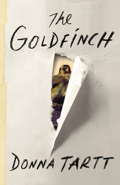
It’s clever, minimalistic, intriguing. A little sneak peek shows the painting that plays a role in the novel, Carel Fabritius’s The Goldfinch. Together with the bold use of white space and interesting, handwritten typography, the design of the cover speaks to the emotions and inspires curiosity.
Night Broken by Patricia Briggs
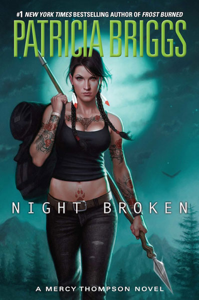
This cover is direct, using well-made illustration. It shows an interesting lady – strong and independent. Some reservations are possible to uh … not very believable bust of the heroine, which may leave a little cheap impression. Generally, however, this cover creates a fascinating atmosphere, attracts the eye and encourages you to reach for the book to learn who this badass lady is.
Unlucky 13 by James Patterson
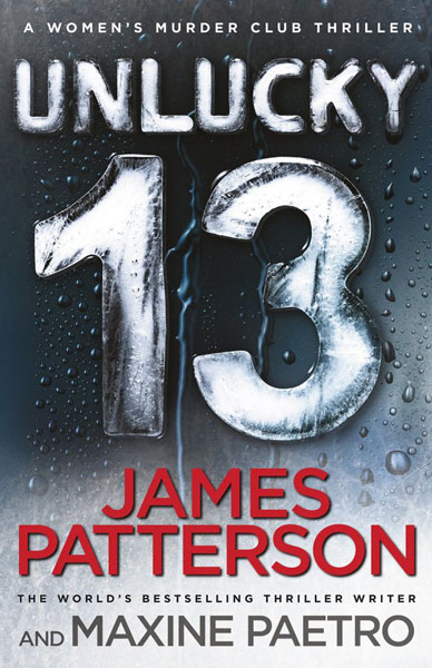
At first glance, one can guess with what kind of novel we are dealing here. Cool colors and red lettering create the atmosphere of anxiety suitable for the thriller. An interesting typography additionally attracts the eye, becoming the main graphic element of the cover.
Mr. Mercedes by Stephen King
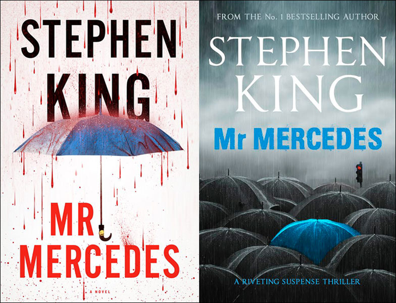
You can come across the two versions of the King’s novel‘s cover. Each one creates an atmosphere of distress in a different way. The one on the left is less subtle, literally dripping with blood, but avoids becoming cheesy thanks to the certain minimalism, white space usage and simple typography. The second cover creates a disturbing ambiance through the cold, cool colors. Being more subtle, it catches an eye thanks to the sparing use of color and a nice design.
Skin Game by Jim Butcher
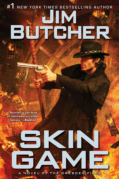
We had already a badass lady, now it’s time for a badass guy. Hot colors, flaming dollars, picaresque hat and cool guy holding a revolver – this is rather a clear announcement of what awaits us during our reading experience. A simple typography distinguishes title and author from the background, while not dominating the image. A good illustration and a good design – the result is a cover which can certainly attract the gaze.
The One and Only by Emily Giffin
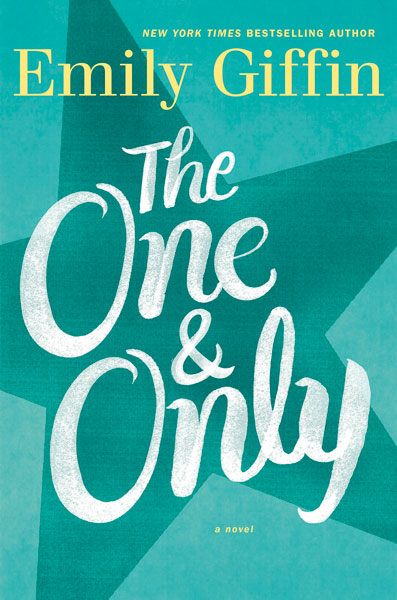
Consistent color, simplicity and good typography – sometimes this is enough to create a good and eye-catching cover. This cover suggests a novel that is warm, deep and feminine, making it easy to attract the right group of readers.
Act of War by Brad Thor
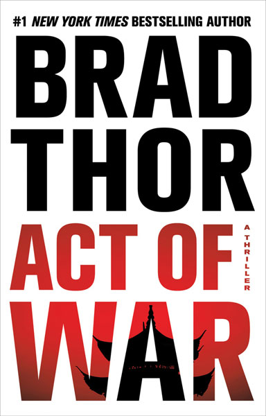
Another example that simplicity is a virtue. Author and title on a white background – what could be simpler? And yet the cover catches the eye, mainly thanks to the large contrasts. In addition, small image cleverly placed on the letters gives a clue to the direction of the story, intrigues the reader and encourages us to dwell deeper into the story.
Invisible by James Patterson
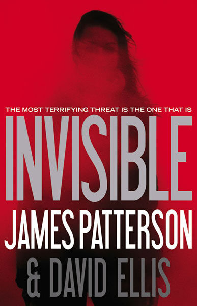
Minimalism is still in. This cover clearly shows what kind of story we are going to get. Deep red attracts the eye, and the subtle, almost disappearing image intrigues and inspires potential readers to uncover the mystery of the girl on the cover.
Fifty Shades of Grey by E. L. James
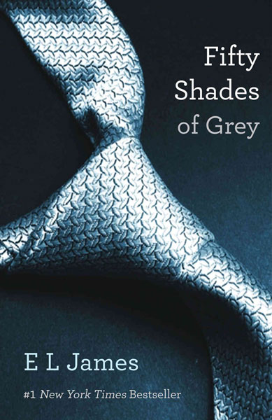
You can actually say that this cover is already a classic. Lack of literalness – especially considering the type of novel – is definitely a plus, helping avoid the tackiness. Cool, elegant colors, sensuous curves of the tie, restrained typography – all of these help attract the eye and tell potential readers about the ambience of the book.
Personal by Lee Child
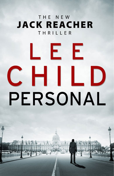
I think that the word “restrained” reflects the best the nature of this cover. Black and white background, despite the minimalist form, gives the clues about the place of action and novel’s character. A simple typography, deep red color, the use of white space – all this adds up to a simple, but intriguing and eye-catching cover.
Gone Girl by Gillian Flynn
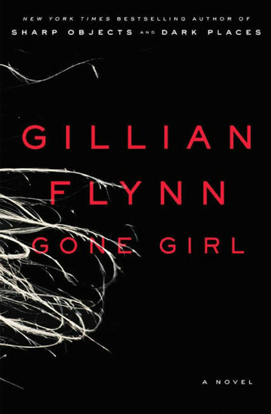
I think this is already an iconic cover. The essence of intriguing simplicity. Black background, red lettering and disturbing, unspecified white graphic – three classic colors for the thrillers’ covers are used here in a new, refreshing way. Using a minimum of means, this cover creates a disturbing and intriguing atmosphere, encouraging readers to reach for this book.