B&N Top 15: What do the bestsellers book covers have in common?
Today I would like to analyze the covers of the fifteen best-selling books from Barnes & Noble to see if it is possible to distinguish some trends or common characteristics among them. This knowledge may prove useful for people designing their own cover, but it could also help me to create designs that could rival the covers of the world best-selling books.
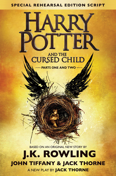
Harry Potter and the Cursed Child
Book cover design traits:
- alignment: centered
- style: minimalistic, fantasy; one graphic element relevant to the story on a simple background
- typography: two types of font, one unique for the title; one color; sans-serif font for the rest of the texts, all letters are uppercase
- colors: yellow, gold, brown, black
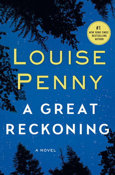
A Great Reckoning
Book cover design traits:
- alignment: centered
- style: minimalistic, moody; typography is the main element, simple background (trees and night sky)
- typography: two types of sans-serif fonts, all letters are uppercase
- colors: blue, yellow, white, black
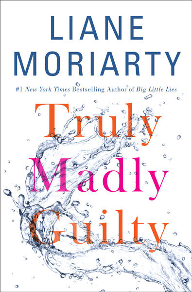
Truly Madly Guilty
Book cover design traits:
- alignment: centered
- style: minimalistic, elegant, subtle; typography is the main element, simple background (splash of water)
- typography: two types of fonts: sans-serif and uppercase for the author’s name, serif and sentence case for the title
- colors: white, blue, orange, pink
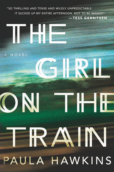
The Girl on the Train
Book cover design traits:
- alignment: scattered
- style: minimalistic, artistic; typography is the main element, simple background (blurred landscape)
- typography: one type of font: sans-serif, uppercase, doubled for the title (imitating movement of the train)
- colors: blue, green, brown, white
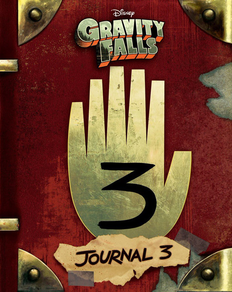
Gravity Falls: Journal 3
Book cover design traits:
- alignment: centered
- style: minimalistic, cartoonish; one graphic element on a simple background (imitating journal)
- typography: using branded title, subtitle in a simple uppercase sans-serif font
- colors: red, gold, brass
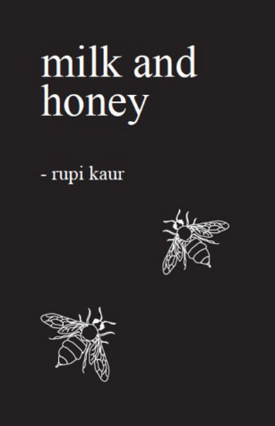
Milk and Honey
Book cover design traits:
- alignment: left
- style: extremely minimalistic, refined; simple typography and two graphic elements on a black background
- typography: one type of font: serif, all letters are lowercase
- colors: black, white
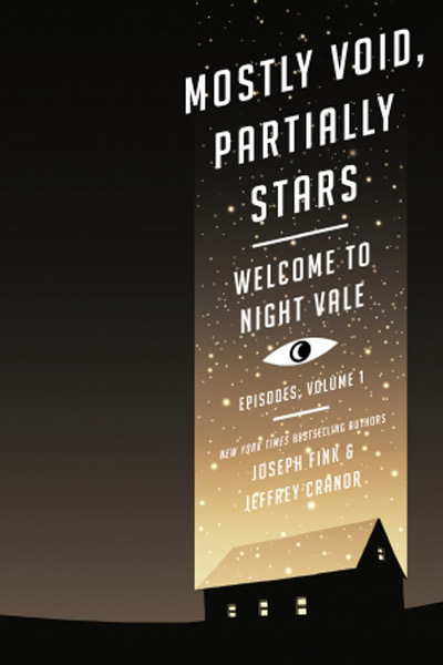
Mostly Void, Partially Stars
Book cover design traits:
- alignment: centered, but only on the right side of the cover
- style: minimalistic, graphic; simple typography and symbolic graphic elements on a gradient background
- typography: one type of font: sans-serif, uppercase
- colors: brown, black, yellow, white
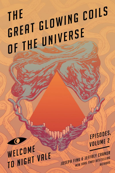
Great Glowing Coils of the Universe
Book cover design traits:
- alignment: right
- style: modern, graphic, simple typography and abstract graphic elements on a hand-drawn background
- typography: one type of font: sans-serif, uppercase
- colors: orange, purple, grey, black
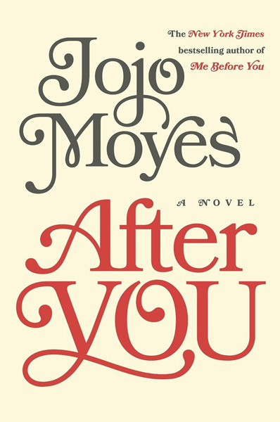
After You
Book cover design traits:
- alignment: centered
- style: minimalistic, elegant; typography is the only graphic element, simple one color background
- typography: one type of font: decorative, sentence case
- colors: pale yellow, red, grey
5% More
Book cover design traits:
- alignment: centered
- style: minimalistic, modern; typography is the only graphic element, simple two-color background
- typography: one type of font: tall, sans-serif, uppercase
- colors: red, white
Just Friends
Book cover design traits:
- alignment: centered
- style: minimalistic, casual; one graphic element on a simple one-color background
- typography: two types of fonts: title in cursive, author’s name in serif font, both written in sentence case
- colors: blue, black, white
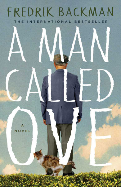
A Man Called Ove
Book cover design traits:
- alignment: centered
- style: movie-like; photographic elements on a simple sky background
- typography: two types of fonts in uppercase: handwritten for title and author’s name, simple sans-serif for the rest of the texts
- colors: blue, green, white, orange
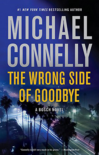
The Wrong Side of Goodbye
Book cover design traits:
- alignment: centered
- style: simple typography on a photographic background
- typography: one type of font: uppercase, tall, sans-serif
- colors: blue, grey, yellow
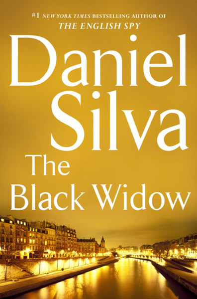
The Black Widow
Book cover design traits:
- alignment: scattered
- style: simple typography on a photographic background
- typography: one type of font: serif, sentence case
- colors: yellow, white
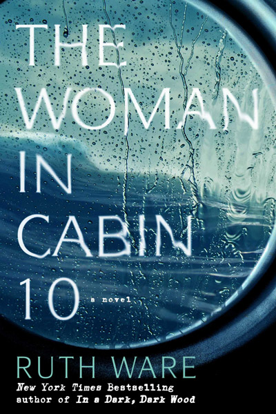
The Woman in Cabin 10
Book cover design traits:
- alignment: left
- style: minimalistic, typography on a simple photographic background (blurred landscape)
- typography: two types of fonts: sans-serif, uppercase, smeared (imitating melting in the rain), typewriter font for additional texts
- colors: blue, turquoise, white, black
Conclusions
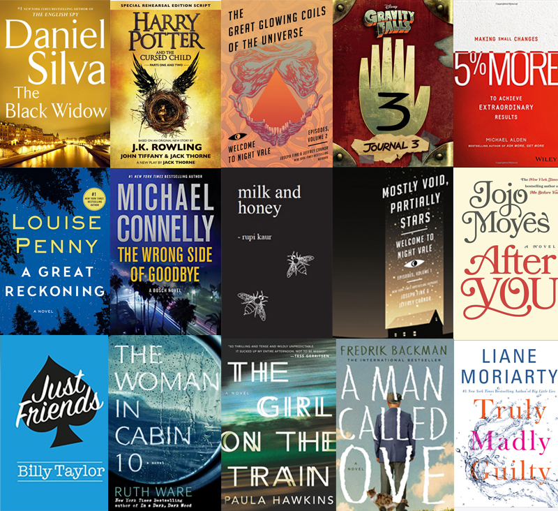
The analyzed covers were representatives of a wide variety of genres – fantasy, thriller, non-fiction, romances, literary fiction… It was quite surprising for me to find out how much they have in common. Few dominant trends in book cover design can be noticed:
- central alignment
- minimalistic style
- no more than two types of fonts on the cover
- limited color palette – one distinctive, main color for the cover
- focus on typography
- no photomanipulations
- no faces, no human silhouettes
- simple backgrounds
- very limited number of objects on the cover
It is interesting that similar trends (maybe except for the central composition) are rarely seen on the covers of the self-published books. This is a topic that I will try to discuss in the next post.


1 Comment
Join the discussion and tell us your opinion.
[…] the last post I was analyzing the covers of the fifteen best-selling books from Barnes & Noble to distinguish […]